Harvest & Home
A farm-to-table restaurant design built entirely around the phone — because 85% of restaurant searches happen on mobile within the hour before eating.
This is a design example — not a real business. It shows what we'd build for a restaurant like this.
What a restaurant site has to do.
A restaurant's website has one job: get the person looking at it to book a table or walk through the door. That means the menu has to be readable on a phone in 10 seconds, the hours have to be front and center, and the reservation path has to be one tap — not a hunt through a third-party widget that breaks on half the phones in the Valley.
Most restaurant sites fail all three. This design doesn't.
Every decision is intentional.
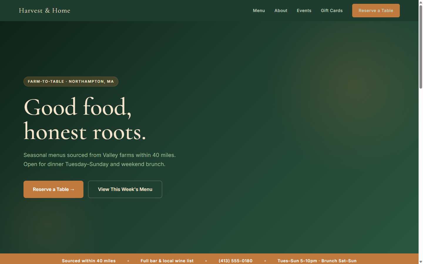
Forest green, cream, and gold match the warmth of the physical space. Cormorant Garamond gives it craft and occasion without looking precious. The menu is native HTML text — not a PDF — so it loads instantly, scales to any phone, and Google can actually read it.
A sticky "Reserve a table" button follows the user down the page so the action is always one tap away, wherever they stop reading.
The thinking behind the design
Mobile-first from the very first line of CSS
Spacing, font sizes, and button placement were decided at 390px wide first, then scaled up for desktop. A restaurant visitor on a phone has seconds to decide — the site needs to work for them, not for the person who built it on a laptop.
Native text menu, not a PDF or an image
PDFs don't resize, can't be read by Google, and require a separate app to open. A native HTML menu loads in milliseconds, is fully indexed, adjusts to any screen size, and can be updated in 30 seconds without touching a file.
A palette that comes from the food itself
Forest green, warm cream, and gold are the colors of a farmers market in October. They signal quality and craft before a visitor reads a single word. Generic blue-and-white templates signal the opposite.
No JavaScript, no frameworks, no weight
This page would score 98+ on Google PageSpeed. No carousel scripts, no tracking pixels loading before content, no framework overhead. Just HTML and CSS that arrives and renders immediately — even on spotty 4G in the parking lot.
Run a restaurant or food business?
We build fast, mobile-first sites for restaurants, cafés, and food businesses across the Pioneer Valley — fixed price, no surprise invoices, live in under two weeks.